How to Develop Strong user Experience with Navigation?
March 26, 2016

Do you wish to evaluate any existing digital product? Are you sure from where to start? Then, you may be in need of some guidance on driving strong user experience along with navigation. We know that navigation is an important tool of the website that is solely responsible for navigation.
Here, we will take a look at three navigation principles that if you adopt on regular basis; you will definitely develop strong user experience. These are as follows:
- Information Architecture that aligns users’ mental models.
- Means for navigating the structure are easily identifiable and are entirely consistent.
- Options available for navigation are reasonable.
You can easily incorporate the below mentioned framework in the UX workflow:
Navigation for Digital Products:
When it comes to navigation; it means the way user moves via websites and applications. It is the part of Information architecture useful for structure and function. One of the important components of navigation is “finding the way” or posting a sign.
This relates to people letting know about different cues and treatments. Every website page may be the one only viewed by the users. Hence, some context is important to goals.

So, the first principle is in regards with information architecture. Let’s define the structure first:
- Defining the structure: One needs to define IA before designing user experience. This can be done with user group where one solicits the number of target users and then ask them to arrange it via different labels into different groups and user expert design.
There are several tools that can be used to define the website structure or software.
- Does Call to Action actually work? The trust and credibility of the site depends on small things like as spelling errors, alignment between buttons and links and their lead destination.
If the user is on product page that has call to action which says “Buy Now” then you will expect it to land on the checkout page. Just avoid unnecessary call to actions or offer them visual weight.
- Is the placement of menus perfect? Know about the designing context. People are habituated to see navigation like as menus in consistent places. For instance; iOS phones have the menu at bottom of the screen while as Android will show navigation options in the hamburger menu.
Another Principle is that the means to navigate the structure is easily recognizable and always available through the entire site.
Do you see the things at its place? Do you find the structure clear and consistent?
The entire user experience is developed from all the things that users encounter. Let’s say a well designed website perfectly meets the standard conventions. The different website components include Logo & Branding, Navigation changes, Contextual cues, Wizards/ Steps, Breadcrumbs, URLs as well as the title of window page.

The third and the most important principle is number of options provided are reasonable. Let’s say in any interface product; be it any iOS app or website, one must have the minimum number of options.
Don’t get the user lost or confused by the website structure; the number of options provided must be reasonable. Having too many options can overload the user and make it counterproductive. In simple terms; we can say that include minimum options.
The drop down option has different links which the user can easily access. Try to make navigation as easy and as simple as possible; you can use some analytics to identify what they have been. For a typical website; it must be pretty simple to lay out seven links on every single page in a consistent manner.
Take Away:
Apart from those mentioned here; there are several principles that boost the user experience with navigation. Just understand the heuristics and principles that are used to define navigation. Just remind good design practices and then examine the existing products.
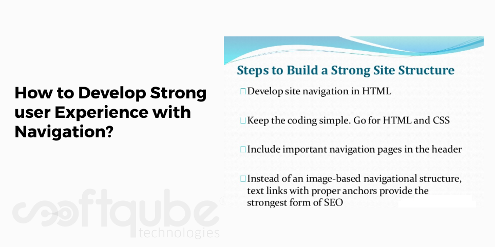
The basic website structure, Information architecture and different pages, labels must match with the user expectations. This guide can be used to develop an intuitive experience. Further, consider the important pages and then include them at the top.
Don’t include more than seven navigation options visible; this can be overdoing. Now, next time when you go for website development India then keep these things in mind. Have something to say? Get in touch with us.
Share on


