Which Colour Combinations must be used for Professional Websites?
March 7, 2016

We always keep on saying; website should be professional, must look attractive, must have this; must have that and what not. But, it is only in mind till the time we are reading it because you know giving advice is easy than applying it on our own.
Same is the case here; whenever someone asks you: What should I do to give professional look to my website? The lecture begins; use this font, use that font, use these many sentences, use less sentences and what not.
But, when your time comes to get a website developed; you will again repeat the same mistake of asking others what should be done to create a professional website. You will find yourself searching in Google “Steps to make a professional site” etc. etc.
Now, when it comes to website; things that play an important role are: a) Programming language b) Website Colours c) Website Content d) Page Speed e) Easy Navigation Process. These are just the main factors; there are several others that also play an important role.
Selection of Programming language comes under web development section and so we will discuss it later on. Today, here in this blog post; we will discuss about “Colour combinations to be used in a website to give it a professional look”.
So, let’s not waste our precious time and begin the discussion:
What Colours can be used in a Website to give it a Professional Touch?
We all know that along with content, website must look attractive. Hence, it is mandatory to have good colour combination as these easily get related with the emotions of website visitors thus delivering them a necessary message.
While selecting colour scheme for any website; it is necessary to choose them in a perfect manner with the main principles of colour theory. So, let’s begin:
How to create Good Colour Combinations: Website colours must be selected keeping in mind the web design principles instead of choosing them based on one’s own colour and taste.
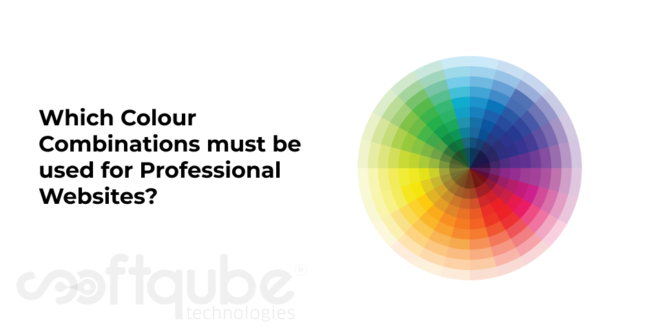
First of all; let’s understand all about Colour Wheel (one of the basic principles of web design)
Colour Wheel: Invented by Isaak Newton in 1666. The colours are defined based on the passage of light via a prism and then changed into a segmented circle where the size of every segment is different as per his calculations.
This colour wheel is the role model of all designers and artists over the entire world. It helps to choose the colours that look harmonious together. The wheel has six basic colours: Red, orange, yellow, green, blue and purple.
In order to get a perfect harmonious scheme; choose any two colours which are opposite to each other on the colour wheel. Choose any three colours that share equal space around the wheel forming a triangle or any four colours that form a rectangle.

We all are aware that Red blue and yellow are primary colours while all colours other than this are secondary colours which can be easily obtained by mixing two primary colours.
Apart from Primary and secondary; there are tertiary colours that are formed by mixing one primary colour with one secondary colour.
Then there are Complementary colours which are situated directly across each other on the colour wheel. Here, you can see Red-violet tertiary is complementary to Yellow- Green Tertiary. These when used provide a striking contrast. Such colours are used to make some website elements stand out.
Other types of colours are Analogous colours which are located next to each other in the colour wheel like as Violet secondary and Purple secondary. Such colour combinations are used to make visitors feel good and comfortable when they visit your site.
Now, let’s see meaning of Colours in Various Symbols:
A website is made to get audience from all over the world. Hence, colour selection must be done keeping in mind the meaning of colours in various cultures because a single website will be viewed by people of all castes, creed and religion. Hence, no one’s feelings should get hurt.
So, here we will throw a Limelight on different meanings of same Colour in different Countries:
-
Red Colour:
- China- Good luck & Celebration
- USA- Christmas and Valentine’s Day
- Christian- Love, Passion, Sacrifice
- Feng shui- Good luck, protection, money
- Japan- Life
- South Africa- Mourning colour
- India- Purity
- Cherokees- Success, Victory
- Hebrew- Sin
- Cherokees- Defeat, Trouble
- China- Immortality
- Iran- Heaven and Spirituality
- Judaism- Holiness
- Hinduism- Shree Krishna’s Colour
- Middle East- Protection
- Feng Shui- Water, Calm, Peace, trust, adventure, relaxation, healing
- Western- Depression, Sadness, Corporate
- Egypt- Mourning
- Japan- Courage
- India- Merchants
- China- Royalty
- Buddhism- Wisdom
- Feng Shui- Earth, Sunbeams, Warmth, Motion
- European- Happiness, Joy, Weakness, Hazards
- European- Creativity, Harvest
- Ireland- Religious
- USA- Halloweens, Cheap goods
- Hinduism- Sacred Colour
- Feng Shui- Earth, Improves concentration
- Colombia- Reduces Sales
- Feng shui- Earth, industry
- USA- Money
- India- Islam
- Islam- Hope
- China- Green hats show that wife is cheating to her husband
- Japan- Life
- Western- New Birth, Saint Patrick’s Birthday, Environmental Awareness
- Fengshui- Growing Energy, Refreshing, Nurturing, Balancing, Healing, health, Calming.
- Thailand- Mourning colour (Windows)
- European- Royalty
- Catholicism- Death, Mourning
- Feng Shui- Physical and Mental Healing, Spiritual Awareness
- European- Marriage, doctors, hospitals
- Japan- Death, mourning
- China- Death
- India- unhappiness
- Feng shui- Death, ghosts, ancestral spirits, poise confidence
- European- Death, Mourning
- Thailand- Bad luck, unhappiness
- Judaism- Unhappiness, Bad luck
- Fengshui- Water, money, career, success, emotional protection, power, bruises and evil
Blue:
Yellow:
Orange:
Brown:
Green:
Purple:
White:
Black:
Meaning of Colours in Websites:
The above all information will now help you to decide the website colours keeping in mind your target audience, region etc. The moment any visitor visits your website; he/she creates some opinion about you in its mind.
Colours play an important role in forming this opinion as this work on subconscious minds of the visitors. If perfect colour scheme is selected to get attention from audiences then maximum work is already done.
So, Here are Some Feelings Generated based on the Website Colour:
- Red: Red colour in any website suggests boldness, excitement and desire. It represents love, strength, power, leadership and excitement.
- Blue: It suggests patience, peace, honesty, trust, truth, love and stability. It is related to professionalism, trust and honour.
- Yellow: Websites with yellow colour showcase liveliness, energy and feeling of happiness along with joy, curiosity, brightness etc.
- Orange: Orange colour in any website suggests cheerfulness and creativity as well as friendliness, confidence, courage etc.
- Purple: It is related to Power, wealth and nobility along with wisdom, royalty, luxury, ambition, dignity, magic and mystery.
- Green: Represents Harmony, nature, healing, life, food and health as well as money.
- Brown: Signifies relaxation and confidence along with earthiness, nature, durability, comfort and reliability.
- Grey: Websites with Grey colour show traditionalism, seriousness, purity and innocence along with security, intelligence, modesty, dignity, old age, sadness, professional, durability etc. It looks awesome when used with orange.
- Pink: Denotes love, affection, romance, truth, positivity, emotional healing, care, peace etc.
- Black: Signifies power, formality, and health. It helps to add mystery to the design. Black can be used to clear your perspective and depth. It is great for art and photography websites.
- White: This colour denotes simplicity, fresh, goodness, cleanliness, purity etc. It serves best when used as back ground colour.
Take Away:
So, next time you are about to create any website and get confused about colour selection then keep in mind this post; it will solve all your doubts.
Let us know how this article has helped you? Stay tuned to Softqube Technologies, a well known Website Development Company; for more of such informational posts.
Share on


